Tuesday, December 29, 2009

I like modernism

I like modernism. It is quite a strong feeling. I've always found the contemporary forms of buildings attractive and the argumentation of Loos on redundancy of ornaments in architecture convinces me as well.


Das Looshaus am Wiener Michaelerplatz: http://www.phwien.ac.at/


I like the oeuvre of Le Corbusier as well. I visited many of His buildings and I find them very convincing. The life in Unite d'Habitation at Marseille is quite agreable - regard yourself.


Pay attention please at the care towards the maintenance of building - vide way of conservation the door frames and the way to keep the floors tidy.

The early modernist housing estates are just genial place of living. Let's look at the Montwiłł - Mirecki neighbourghood in Lodz.


source: http://i204.photobucket.com/


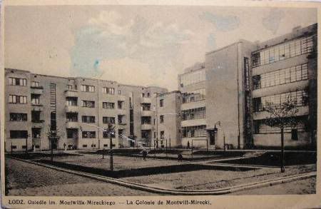
The distibution of law blocks of flats, the inside courtyards, beauty of architecture and the approximity of greenery - all this forms great  environment for living and social relations. I'm convinced as I used to live there for a couple of years. The cosiness is also supported by different width of passages and streets, distribution of services and - what important and interesting as well -  fences in form of brick walls, but with the open passages.

There are many people who like modernism neighbourhoods of  small scale, e.g. Teofilów or Radogoszcz West in Lodz. With many trees, facilities, playgrounds, and of small scale of constructions and spaces inbetween the blocks. Because these places are cosy and nice to live in. Even if the buildings maintenance needs some additional efforts.

Also Le Corbusier in the realised project of the town renounced of the former theorethical concepts of  gigantesque towers. Chandigarh - also called a beautiful city - consists of many distinquished units of theirs own infrastructure, including schools, kindergardens, services.


The forms of constructions do not overwhelm - they may incite enchantment. Because of the detail, colours, forms, propotions, harmony. They find the admirers and are accepted.

It is difficult to accept the wrong solutions. Badly done, of materials of poor quality, not properly maintained and neglected. Overscaled. The blocks of flats produced in a mass in the factories, distibuted - as it was said then - according to the crane rout. To enable easier work of the crane. Not for people convinience. Without infrastructure, without services. Or the neighbourghood where new block where introduced to make former project denser. The conclusion comes to mind and seems evident - good things defend themselves. The only small reflection - verification lasts long and usually costs a lot.

Sunday, December 27, 2009

Ideas in urban planning may occur detrimental

The ideas which at the very first glimpse seem great may occur detrimental. An example of such an idea became the district Le Mirail in Toulouse erected in 60-ties XX century according to the design by George Candilis - one of the associates of Le Corbusier and successor of his ideas. At the beginning the argumentation seemed extremely attractive..

Traditional Place de Capitole in center of Toulouse is crowded with cars from the early afternoon. The parking place takes the whole surface of the square:

This as well as the following photos go from the film cited above which explains the design ideas and which was realized with the participation of the project author Candilis. The same as the ideas which are cited here.

That's why in the new quartier Toulouse le Mirail the car movement will be in the durable way separeted from the pedestrian movement. We do not want the squares and piazas to become taken by cars, we want them to be destined for people.

That's the reason of creation of the continouous wall of buildings which separates the two worlds - the world of people and rest and the world of cars and work:


The linear center of Toulouse Mirail is accompanied by linear drawing of formerly existing green areas.

Within the green areas there are the monuments historic which are to be preserved and reconverted to the contemporary uses.

The XIXcentury city is too dense. It should be replaced by open green areas. The inhabitants should be assured the appropriate living conditions.. The streets should be left for the sphere of work and the rest needs open green areas.


View of the whole of the project.


And the model of future constructions. Buildings in the form of block of flats of huge hight and length. Housing the appropriate number of flats - the same as in the tenement houses of the traditional city.

All these beautiful ideas and gorgeous aims were not realized. Or worse - the project had been accomplished and the effects occured different than the assumtions. The ideas of Candilis - the designer of Toulouse le Mirail were just fiction.

The film below is a series of photographs made in 2002, when the revitalisation of the quartier was decided as well as the restoration of the "scale of the city". The decision was followed by demolition of the important part of existing blocks of flats. The reasons for demolition: non-human scale, environment impossible to change and to reconvert into more humanitary one. The social problems: exclusion, crimes, sense of danger, drug-addiction, which took place in the quartier were also significant.

The quartier just before and during the demolitions :
Very interesting film showing the interview with the designer of Le Mirail - George Candilis. He admits that the conceived scale of the housing had been too big and that he realised that after it was built: http://www.ina.fr/art-et-culture/architecture/video/I07113548/toulouse-le-mirail.fr.html

Below the demolition of one of buldings. The blocks which formed the barre dividing two worlds- as assumed at the very beginning: the world of cars and pedestrians, the world of work and rest - and which in reality became the walls of ghetto.

The ideas became fiction. But this is not the end of the story. The further actions which had to be undertaken in le Mirail to recover the quartier have been very expensive.


The reconversion project budget is 314 mln Euro and it is the highest budget for such project in France. It covers two main fields of activities: social and urban. The project aim is to reconstruct the traditional city in le Mirail. And the main issue - to liquidate the ghetto. The info goes from the GPV (Grand Projet de Ville) site.

The photo below shows "the street" which used to join two worlds. The photo is a cadr of film Expropriations au lance pierre, d'un monde à l'autre.


Was it really impossible to imagine this space, check the scale and think before the quartier had been constructed? It is difficult to judge now. That's enough to say that this experiment on human beeings.. did not succeed.

Monday, December 14, 2009

More outtakes

More outtakes from our current issue: this time, the house on Great Barrier Island designed by Paul Clarke of Crosson Clarke Carnachan Architects. The photographs are by Simon Devitt.

This one shows the house's open-air (but covered) corridor. On the left is a storage cupboard, a small laundry alcove, and a toilet. The bedrooms are on the right, with the main living area at the end of the corridor. The open-air corridor may make for a slightly chilly trip to the bathroom in winter, but Paul believes that it's important to remain connected to the elements at a holiday home, something the owners heartily agree with.

This arresting view looks along the home's eastern flank, showing its cedar exoskeleton.


Here's a view of it in its bush-clad setting, in a field a little back from Medlands Beach. This is like the view you get of the house when you approach - it's an intriguing object from the driveway, with its monopitch roof pointing optimistically skywards.


Paul Clarke wished we had included this shot in our layout, so I've put it here for him. He likes the way the home's exoskeleton mimics the verticality of the trees.

And this is another view through the home's deck and living area.

TV3's Sunrise focuses on architecture

TV3's Sunrise has recently been featuring a series of great homes that have previously been seen in HOME New Zealand. We see it as another opportunity to tell people about the importance of using a good architect when creating a home, whether it be a new home or an alteration. You can see the footage for their feature on artist Michael Shepherd's home and studio, designed by Stevens Lawson Architects, at this link:

http://www.3news.co.nz/Take-a-peek-inside-a-city-home-with-a-difference/tabid/572/articleID/133720/Default.aspx

Outtakes

A lot of people are very interested in the house by Amanda Yates that features on our cover. The beauty of this blog is that it allows us the luxury of featuring extra images of it. Amanda's aim with the project was to reference early Maori earthern architecture, dwellings that were actually part of the land, and you can see here how the house on the Coromandel Pensinsula follows the contours of the land.

The way the home's interior slope meets the rock face outside is immaculately detailed, as you can see in this image (all the photographs are by Paul McCredie):

One of the great things about the house is the way the mood of the slope changes through the day under different lighting conditions.
Outside, the home's roofline also follows the slope. Upstairs is a self-contained studio used by Amanda and her partner when they visit her parents, who live there full-time.
Roy from SGA Architects requested a context shot in our layout that showed the home in its location. Here is one that shows a wider view of it on its site:

We're back

We end this long and embarrassing silence (blogging seems so easy to start with then suddenly, it becomes difficult to think of things to say ... then you're out of the habit) with an announcement of a recent innovation: from our December/January issue onwards, we are publishing special (and hopefully collectable) subscriber-only covers.

This is the newsstand cover for our next issue, a photograph by Paul McCredie of a house on the Coromandel Peninsula designed by Amanda Yates:

And this is our subscriber-only cover, another photograph by Paul of the same house.


You'll see that we have the luxury of being a little more pure with our subscriber cover. We are no longer subject to the tyranny of the barcode, and are under less pressure to include lots of coverlines to shout from the newsstand. Hopefully it's an object that will sit more serenely on your coffee table or beside the bed.

Monday, December 7, 2009

The fourth dimension of urban design

It happens more and more often. Architecture, urban space becomes dynamic, looses the quality of being static. It becomes great, interactive screen like the Kunsthaus in Graz.


Or like in the design of Frank Gehry for Camerimage Center in Lodz, Poland, where a great wall - a screen is to present what happens inside.

Source: GW Łódź

Like in the project of metro station Wileńska in Warsaw - where a new quality is added to the underground space. The walls which are to be screens showing what is upstairs.


Source: Bryla.pl

I like very much the idea of Mood Light. The project realised in Amsterdam for the underground passages within modernist neighbourhoods . The movement as an element inducing light pulsation, and the pulsation of space. It increases the quality of space and influences the feeling of safety.


Source: Bryla.pl

We are not only the cause of light movement - we stop to feel opressed, helpless towards the wall of dark unpleasant concrete. Like in the children room, when mum turns light off. And a kid is left alone. Such interventions increase the quality of space and do not cost so much as the redevelopment of current constructions.

Interaction, movement as an element of urban design. There is a great difference between this appoach and the one presented by the current trend setters of automotive industry. I.e. like these presented on the Discovery Channel in the programme Future Cars.


Development of methods to utterly isolate humans from the outside space. To ensure a mini center of entertainment and communication within a car. So what do you prefer? There is a choice: THE CITY or a car?


Wednesday, November 18, 2009

SPRAWL - two different approaches

I asked one of my Italian student (ERASMUS) participating in Urban Planning Studio classes for Architecture Engineering to prepare the presentation concerning her former project, realised earlier at her maternal university. I've been intrigued about what she talked on computer researches with GIS concerning the isochrones of pedestrian access to the services, ie. shops. Girls - there are two of them - use to study environment protection in Italy. The subject of theirs project was the possibilities to regain soil after the urban sprawl for the agricultural uses.
So how it is - we in Poland think how to protect or - which is unfortunately more common - we work hard how to develop urbanised areas. Sometimes it happens to be ridiculous. And in Italy they think exactly the contrary. The group of Polish students seemed shocked.
Don't know what to do, lets pray for wisdom..

Althought there are places where we - Poles should start to worry, ie. below:

source: www.zumi.pl


Tuesday, November 10, 2009

Rabbit à la Berlin


Yesterday a Polish TV showed a film Rabbit à la Berlin. The description of the city torn away, its durable functioning in abnormal situation and the slow process of scaring over - all these are only one side. The most sriking is the analogy to the socialist society. All of us, who used to live during the optimum period of rabbits'development - we are all stigmatized with the "rabbit sign". Rabbits do what they are said to do: spawning, eating, fuctioning without any question about the future, tied to theirs small burrows, etc, etc. Then rabbits began to go away but this is quite another story.. New rabbits, these who are born later are completely different. They are not afraid to express theirs feelings.
For me the film is extraordinary. Below an interview with the director of Rabbits Bartek Konopka.


Among the examples of contemporary urban design which I use to show to my students there is Lenne Square in Berlin by Topotek 1. The square - as a matter of fact - just a place in a rushy street, created to preserve the memories, the genius loci and as a homage to one of the greatest landscape architects. The double line of natural stones follows the tracing of the former Berlin Wall. The place created to interrupt movement, to stop the passers-by with the use of all possible design tactics. To force the moment of contemplation and reflection.

Source: Topotek 1

Monday, October 19, 2009

The villa

A little self-promotion here, but those of you who are interested in architecture may also be interested in the book Villa, which I worked on with Patrick Reynolds and Jeremy Salmond. In it, we've celebrated the adaptability and diversity of occupation of this uniquely New Zealand building form, visiting, photographing and writing about 20 villas from Dunedin to Hokianga. All the homes have been photographed by Patrick, who came up with the idea for the book after renovating his own villa, which is featured on our October/November cover. Here's the book cover if you're interested in looking out for it. The book is published by Random House, and I've vowed never to do another one at the same time as my full-time job.

Outtakes

It's outtakes time again - this time we've selected extra shots of the house designed by Ken Crosson and Carolyn Gundy of Crosson Clarke Carnachan Architects on the Kaipara Harbour that features in our October/November 2009 issue. It's never possible to show every aspect of a house without a magazine layout feeling repetitious - what we hope to convey is a sense of the essence of a house, and also to make our readers feel as if they've had a good look around. This house is big and made of many complex parts, so I think it's useful for us to show a few extra of Patrick Reynolds' images here.

This one shows the exterior as you arrive at the home and look towards the harbour. On this elevation of the house, the copper walls are windowless and impassive, lined with nikau palms.


Here's a view of the home's main living pavilion, sheltered from westerly winds by the hills behind.

In contrast to the huge volume of the main living area - which Ken likens to the inside of an upturned galleon - the bedrooms have lower ceilings and are more intimate, cosy spaces, although still lined in the same ply as the rest of the home. The headboard is made from macrocarpa and was designed by the architects.

This particularly good-looking shot - which it gave us great pains to leave out of our magazine layout - is a view from the deck outside the living pavilion, looking north to the master bedroom suite.

A corner shop

Once again I watched the Smoke by Wayn Wang. I like the film very much, especially a story on every-week photographs - always from the same place and always at the same direction - done by the main hero.


Pay attention please how important in this film is the situation of the shop at the corner of two streets. If it is somewhere else less people would visit it. And it would be less important for its clients.

Jane Jacobs in the cult book Death and Life of Great American Cities writes that a cross road is the best place for a corner shop. There are places where the movement is higher than elsewhere. And she is undoubtly right.

Lets look at the way of thinking of Ildefons Cerda - designer of Eixample, the 19th-century "extension" of Barcelona. He must have thought in the similar way - cutting of the corners and creating small squares there. Look how much movement takes place there.


A typical cross road in Barcelona - source Google StreetView.

Corners use to be places where life flourishes. The thesis has a language acknowledgement - the corner shop.

I am not quite sure why the thesis above does not always prove true. Wayn Wang could make his film in some neighbourhoods only - not just at any corner shop.

Tuesday, October 6, 2009

Thursdays at L'affare

A reminder to all you Wellingtonians that the eminent architect and raconteur Roger Walker will be giving a talk tomorrow night (Thursday October 8) at 6pm at Caffe L'affare. Entry is free and so are the drinks. Come and join us for what will be a fascinating and entertaining talk. There's more information on the website of the Architectural Centre, the nice folk who helped us put this event on: www.architecture.org.nz. Hope to see you tomorrow! And thanks to Caffe L'affare for hosting us.

Our new cover

Here's our latest cover, shot by Patrick Reynolds at his own house (a villa extension designed by Malcolm Walker) using his daughters, Rainer and Rosza, as models. Keep it in the family, we say. A few readers have found it unusual that we've used people on the cover, but it's something we try and do where it seems appropriate, and where the shot works. This time we borrowed dresses from Sera Lilly for the girls because we thought they would suit the issue's Fashion + Architecture theme. If we do feature people, they're always the architects or the owners of a home - using models always seems weird.


Saturday, September 26, 2009

More fashion and architecture

More fashion and architecture collaborations, this time between Miuccia Prada and OMA's Rem Koolhaas, who designed 'The Transformer', a temporary performance and exhibition space in Seoul. I keep accidentally calling it the Hadron collider, because it looks as it it's about to do something atomic.


Koolhaas, of course, also designed Prada's New York and Los Angeles stores. There's more about the Transformer on Wallpaper's site, at this link: http://www.wallpaper.com/fashion/prada-transformer-seoul/3284

Friday, September 25, 2009

Fashion and architecture and the great buildings they produce

Thinking about fashion and architecture, as we do in our latest issue, brought to mind the number of great buildings produced by the melding of these two creative disciplines. A personal favourite is SANAA's Dior store on Omotesando in Tokyo, an ethereal creation that looks as beautiful by night as it does by day.


One of the nicest things about this building is its scale. In the west, we tend to think of great architects designing tall buildings or museums or other such monoliths, yet Omotesando in particular is full of smaller creations by great architects, little architectural jewel boxes whose small scale makes them all the more magical.

Thursday, September 24, 2009

Shigeru Ban

In Auckland last week, Japanese architect Shigeru Ban gave a talk to a capacity crowd in the Auckland Town Hall. Ban is best-known for his work using cardboard tubes as a building material in everything from refugee shelters to glamorous Expo pavilions, but one of my favourite pieces he showed was his 'Curtain Wall house' in Tokyo, which replaces the architectural version of a curtain wall with, quite literally, curtains. It's witty but also extremely beautiful.


Currently under construction: the much weirder outpost of the Pompidou Centre in Metz, France, scheduled for completion later this year.

Monday, September 21, 2009

Fashion and architecture

You may or may not care, but this week is Fashion Week, so here at ACP headquarters (the home of Fashion Quarterly, and other fashion-obsessed magazines) there has been a great kerfuffle about who's scored tickets to which designer's show, and so on.

Here at HOME New Zealand, we cannot claim to be above the fray. In our next issue, which we're just sending to the printers today (and will be on sale Monday October 5), we've asked 11 New Zealand fashion designers to choose their favourite buildings.

Kate Sylvester (shown below) chose a home designed by Stevens Lawson Architects that won our Home of the Year award in 2007. The photograph is by Mark Smith.


The surprising thing was how many of the other designers - who include Karen Walker, Trelise Cooper, Beth Ellery and Alexandra Owen - chose historic buildings as their favourites. We presumed that these of-the-moment designers would be obsessed with contemporary structures. Then we wondered if timelessness actually stems from a design being of its time, rather than trying to stand apart from it.


You can check out the other designers' choices when our October November issue comes out. We hope you enjoy them.

Tuesday, September 8, 2009

Little and often

I apologise for having broken one of the cardinal rules of blogging: to communicate little and often, ideally in easily digestible daily chunks. It's also important to have something to say, and today we do: we have two talks coming up (presented in association with Wellington's Architectural Centre) at Caffe L'affare in Wellington that y'all are invited to.

Tomorrow night (Thursday September 10 at 6pm) architect Sharon Jansen of Tennent + Brown Architects will be giving a talk about two homes she's recently completed (one of which one a NZ Institute of Architects National Award for Architecture) and some she's designing at the moment. Entry to the talk is free (as are the drinks), just email homenewzealand@acpmagazines.co.nz to register. Here's Sharon:

And here's Turn Point Lodge, the house she designed in the Marlborough Sounds:

And this one's the house in Leigh. All photographs by Paul McCredie.

On Thursday October 8 (same time, same place) Roger Walker will be talking about some of his latest work. You can register for his talk at the same email address.


And here's one of the townhouse projects Roger has been working on: